Walk into a home that flows and you feel it immediately, even if you can't say why. Each room is distinct, yet nothing clashes; you move from the living room to the kitchen to the hallway and it all feels like one intentional place. Walk into a home that doesn't flow and you feel that too — a vague disjointedness, as if the rooms were decorated by different people who never spoke.
Cohesion is one of the things that most separates a professionally designed home from a well-meaning DIY one. And it isn't magic or expensive taste. It's a system of repeated, deliberate choices. Here are the seven principles designers use to make a whole home feel connected — and how to apply them yourself.
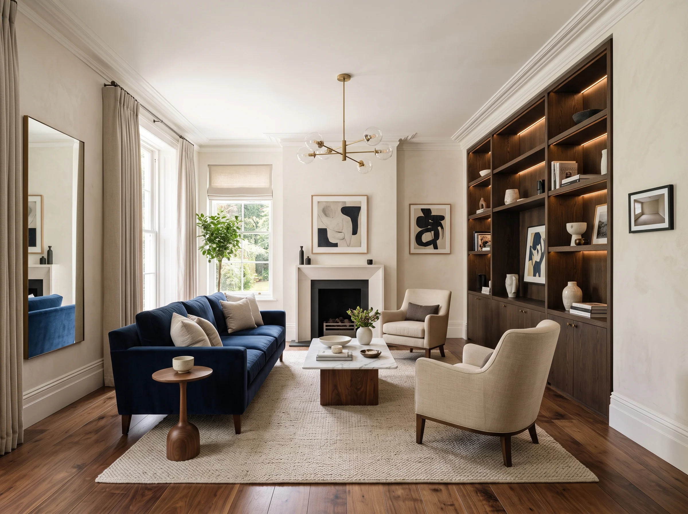
1. A Shared Color Story
The foundation of cohesion is a color palette that runs through the entire home. Designers establish a shared neutral base — the wall colors, the large furniture, the flooring tones — that stays consistent from room to room. Then each individual room draws one or two accent colors from a single, related family. Your living room might lean into a deep teal accent, your bedroom into a softer blue-green, but both are drawn from the same corner of the color wheel, so they feel like relatives rather than strangers. The neutral base ties everything together; the accents give each room its own personality without breaking the family resemblance.
2. A Consistent Wood Tone Family
Nothing fractures a home's cohesion faster than randomly mixed wood tones. A light blonde oak floor in one room, a dark walnut table in the next, a reddish cherry cabinet somewhere else — chosen without a plan, they fight each other. Designers pick a wood tone family (warm mid-browns, say, or cool light woods) and vary within it rather than across the whole spectrum. You can absolutely mix woods, but they should share an undertone and a rough temperature. Consistency here does an enormous amount of quiet work to make a home feel intentional.
3. Flooring Continuity
Flooring is one of the largest visual surfaces in any home, so continuity matters. The strongest cohesion comes from running the same flooring material through connected spaces, which visually merges rooms and makes the whole floor plan read as one. Where the material changes — tile in a bathroom, carpet in a bedroom — designers make sure there's a strong visual relationship between the adjacent floors rather than a jarring transition. Continuous or clearly related flooring is one of the most effective flow tools there is, precisely because there's so much of it.
"Cohesion isn't one grand gesture. It's the same neutral, the same wood family, the same metal finish, repeated quietly enough that your eye reads the whole home as a single thought."
4. A Consistent Lighting Hardware Family
Metal finishes are a detail people rarely think about and designers never ignore. If your light fixtures, cabinet pulls, faucets, and hardware are a chaotic mix of brass here, matte black there, and chrome somewhere else, the home feels subtly unresolved. Designers choose a lighting and hardware finish family — all brass, all matte black, all brushed nickel — and hold to it, or mix metals only deliberately and sparingly. Committing to a finish family across rooms is a small decision with an outsized effect on how pulled-together the home feels.
5. Scale Consistency
Furniture scale should feel related from room to room. If one room is full of oversized, chunky pieces and the adjacent room is all delicate, spindly furniture, the shift feels abrupt and disjointed. Designers keep the scale of furniture broadly consistent across connected spaces so that moving between rooms feels smooth rather than like stepping into a different house. The pieces don't have to match, but their weight and proportion should belong to the same conversation.
6. Visual Sight Lines
Designers think constantly about what you can see from where. Stand in each doorway and notice what's visible — often you can see into two or three rooms at once, especially in open or semi-open plans. Those sight lines are where cohesion is won or lost, because they're the moments your eye directly compares one room to another. Designers make sure that whatever is visible from a given vantage point works together: the colors you see side by side harmonize, the styles in view don't clash. Designing for sight lines rather than for isolated rooms is a big part of what makes a home feel considered.
7. Repeating Elements
Finally, designers thread a few repeating elements through the whole home — a recurring color, a repeated texture, a material that shows up in each room in some form. A particular warm brass. A specific shade of green that appears as a cushion in one room, a vase in another, a piece of art in a third. A woven or rattan texture that recurs. These repetitions act like a visual refrain, and the eye reads them as intention. It's often the subtlest of the seven principles and one of the most powerful, because repetition is exactly what the brain interprets as "this was planned."
A Practical Exercise You Can Do Today
Here's how to see your own home the way a designer does. Photograph every room, then assemble all the photos on a single page or screen, side by side. This one move is remarkably revealing. Inconsistencies that are invisible when you experience the rooms one at a time — because you can't hold them all in memory simultaneously — become obvious the moment they're all in front of you at once.
You'll spot the wood tone that doesn't belong, the accent color that clashes with the room next door, the lone chrome fixture in a house of brass, the one room whose furniture is a totally different scale. Seeing them together turns a vague feeling of "something's off" into a specific, fixable list. This is essentially what designers do when they build a whole-home board — they force all the rooms into one field of view so the relationships become visible.
How AI Makes This Easier
The hard part of cohesion has always been testing it. You establish a color story in the living room, but will it actually carry into the adjacent kitchen and dining area? Historically the only way to know was to commit — buy the paint, install it, and hope the flow held. AI visualization changes that. You can test a room's color story on a photo of that room, then carry the same direction to the next room and see whether it truly connects, all before spending anything.
Try your shared neutral and accent family in the living room, then apply it to the bedroom photo and check that they read as relatives. Test whether the wood tone family works across your kitchen and dining space. See whether the sight line from your hallway into two rooms actually harmonizes. Cohesion is fundamentally a visual relationship between spaces, and being able to preview that relationship — room to room, before committing — is exactly the kind of check that used to require a designer's trained eye. Now you can see it for yourself.
Bringing It Together
Cohesion across a home comes down to seven repeated choices: a shared color story, a consistent wood tone family, flooring continuity, a unified hardware finish, consistent scale, harmonized sight lines, and a few deliberate repeating elements. None of them is dramatic on its own. Together they're what makes a home feel like one intentional place rather than a collection of separate rooms.
Start with the photograph exercise to find where your home breaks flow. Then use the seven principles to plan the fix, and test the shared color story room to room before you buy. That's the entire system designers use — and every piece of it is now something you can do, and see, yourself.