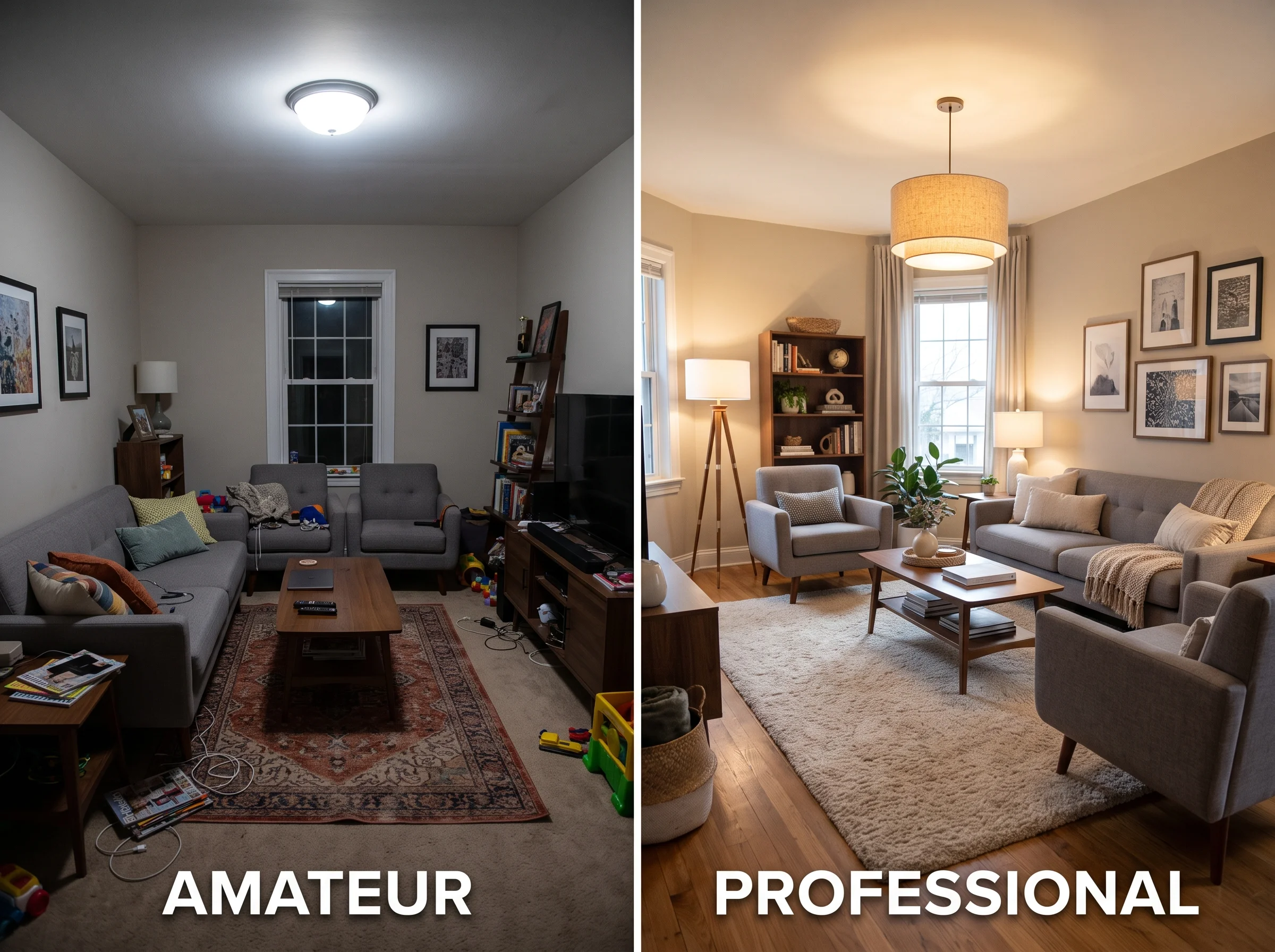
Walk into a professionally designed room and you feel it before you can explain it. The space looks done — settled, intentional, complete. Walk into a room that was furnished piece by piece over the years and it often feels assembled instead: nice things, arranged near each other, not quite adding up. The strange part is that the second room frequently cost more money than the first.
The gap almost never comes down to budget. It comes down to a handful of specific decisions that professionals get right and most homeowners have never been told about. Here are the markers that separate the two, and the fix for each.
1. Scale Errors — the Number One Giveaway
Scale is the single most common thing amateurs get wrong, and it shows up in three places.
Rugs too small. The classic mistake is a rug floating in the middle of a seating area like a postage stamp. The rule: a rug should sit under all the legs of your furniture, or at minimum under the front legs of every seat. If your sofa and chairs are marooned on the bare floor around a small rug, the whole arrangement reads as unanchored.
Furniture too small for the room. A loveseat in a 15-by-20 living room looks lost. Big rooms need furniture with presence — a full sofa, generous chairs — or the space feels underfurnished no matter how much you spend.
Artwork too small. A single small frame hung in the center of a large wall reads as a lonely dot. Professionals go bigger: one large piece, or a grouping sized to fill roughly two-thirds of the wall or the furniture below it.
2. Furniture Pushed Against the Walls
Almost everyone lines the walls with furniture, believing it makes the room feel bigger. It usually does the opposite. Floating your seating inward — pulling the sofa off the wall, angling chairs toward each other — creates an actual conversation area and, counterintuitively, makes the room feel more considered and often larger. The empty perimeter that results reads as breathing room, not wasted space.
3. Only One Light Source
The fastest way to make a room feel like an office is a single overhead fixture doing all the work. Professional rooms layer light in three tiers: ambient (overhead, general fill), task (table and floor lamps where you actually read or work), and accent (a picture light, a small lamp, something decorative). As a rule, the lower and warmer the light, the more inviting the room. Kill the overhead, turn on three warm lamps at different heights, and the same room transforms.
"The difference between a room that looks done and one that looks assembled is rarely the price of the furniture. It's scale, restraint, and light."
4. Too Many Competing Focal Points
A good room has one clear focal point — a fireplace, a bed, a striking piece of art — and everything else supports it. Amateur rooms often have four things all shouting for attention: a bold rug, a gallery wall, a statement sofa, and a busy light fixture, none of them yielding to the others. The eye doesn't know where to land. Pick the hero, and let the rest play a supporting role.
5. Inconsistent Wood Tones
Three different wood tones scattered around a room — an orange oak table, a gray-washed shelf, a dark walnut chair — read as accidental. Professionals do one of two things: commit to a single wood family so tones relate, or mix tones intentionally and repeat each one at least twice so the mix looks deliberate rather than random. The key word is intention.
6. Overcrowding
Amateur rooms tend to fill every surface. Professional rooms breathe. Empty space — a clear stretch of console, a bare corner, negative space around a chair — is itself a design element. It gives the eye somewhere to rest and makes the pieces you did choose feel selected rather than accumulated. When in doubt, remove a third of the objects.
7. Pillows All the Same Size
A row of five identical 18-inch pillows looks like it came out of a bag from a big-box store, because it usually did. Professionals vary the sizes: a couple of larger 20-inch pillows at the back, smaller 18-inch in front, and a lumbar pillow to break the symmetry. The mix of scales reads as styled; the matching set reads as default.
How to Test the Fixes Before You Buy
Here's the practical problem with all seven of these: you often can't tell whether a fix will work until the furniture is already in the room and paid for. Buying a bigger rug on a hunch is an expensive experiment if the hunch is wrong.
This is exactly what visualization tools are for. Upload a photo of your actual room and you can test a larger rug, a floated furniture layout, a different lighting mood, or a scaled-up piece of art — and see whether the room reads as professional before you spend anything. The seven rules above are simple to state and easy to get wrong in practice; seeing the change applied to your real space closes that gap.
The Underlying Principle
Notice what all seven markers have in common: none of them is about spending more. Bigger rug, floated furniture, layered light, one focal point, coherent wood tones, more empty space, varied pillows — every fix is about intention, not budget. Professional rooms look professional because someone made deliberate choices about scale and restraint, then tested them until the room resolved.
You can make those same choices. The rules are learnable, the fixes are mostly free or cheap, and the ability to preview them on your real room takes the guesswork out. That's the whole secret — and now you know it.