Japandi is the design language that finally resolved an old argument between two of the most influential aesthetics of the last century. Japanese interiors gave us reverence for negative space, natural materials, and the quiet beauty of things that age well. Scandinavian interiors gave us functional furniture, generous daylight, and the everyday comfort the Danes call hygge. For decades, design magazines treated them as separate conversations. Then somewhere around 2018, a quiet hybrid began appearing in homes from Copenhagen to Kyoto to Brooklyn — a style spare enough to breathe in, warm enough to fall asleep in. That style is Japandi.
What makes Japandi worth understanding now is that it is not a passing trend. It is the rare aesthetic that holds up under daily life: forgiving of children and pets, gentle on the eye in low light, and resilient against the boredom that hits most styled rooms after eighteen months. This guide walks through what Japandi actually is, the palette and material rules that hold it together, and how to test it inside your own room before you change a single thing.
What Is Japandi, Really?
Japandi is the deliberate fusion of two philosophies that turned out to share more than anyone expected. From Japan comes wabi-sabi — the appreciation of imperfection, asymmetry, and the patina that comes from time. A cracked ceramic bowl repaired with gold lacquer (kintsugi) is more valued than a flawless new one. A wooden beam darkened by a hundred winters of woodsmoke is more beautiful than a freshly milled board.
From Scandinavia comes hygge — the active practice of warmth, softness, and intentional comfort against long dark winters. A wool throw on a reading chair. Beeswax candles at four in the afternoon. Linen sheets in pale oat. Where Japanese minimalism risks austerity, Scandinavian hygge supplies the warmth. Where Scandinavian functionality risks blandness, Japanese reverence for craft supplies the soul.
The combination produces a third thing: warm minimalism. Rooms that are visually quiet without being cold. Spaces with very little in them, where the few things that remain feel deliberately chosen and quietly loved.
The Core Principles That Hold Japandi Together
Most rooms that fail to read as Japandi miss at least one of these four principles. The style is unforgiving of half-measures because it relies on the relationship between elements rather than the abundance of them.
- Negative space is a material. Japandi rooms treat the empty wall, the bare floor, and the uncluttered shelf as positive design choices — not gaps waiting to be filled. The empty space gives the few present objects somewhere to breathe.
- Every material must be honest. Real oak rather than oak veneer over MDF. Linen rather than poly-linen blend. Stoneware ceramic rather than glossy reproduction. Japandi reads warm partly because the materials behave the way the eye expects them to behave under light.
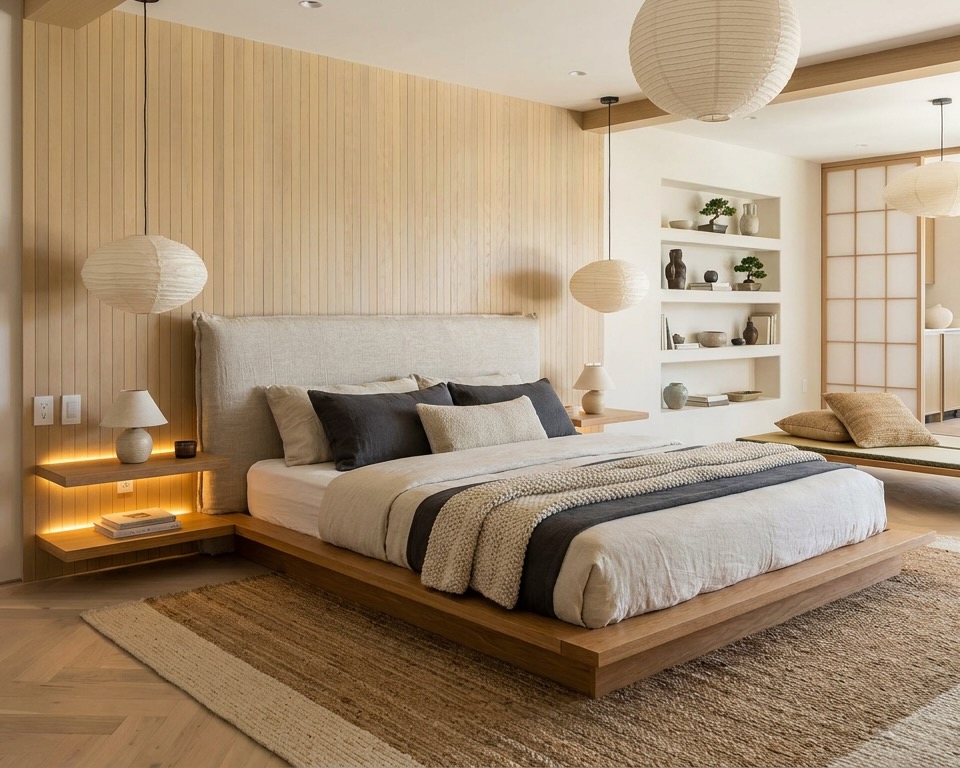
- Low profile, grounded. Furniture sits low to the floor. Beds are platforms or low frames. Sofas are deeper and lower than contemporary average. The horizontal eyeline calms the room.
- Patina is a feature. A leather strap that has darkened with use, a wooden cutting board with knife marks, a linen runner that has softened in the wash — Japandi welcomes the evidence of life. New-looking and over-protected reads wrong.
The Japandi Color Palette
The mistake most people make with Japandi is treating it as a grey palette. Grey is the wrong center. The right center is warm neutrals: colors that lean toward yellow rather than blue, toward earth rather than ash.
A working Japandi palette typically includes:
- Warm whites — bone, oat, lime-wash white (think Farrow & Ball's Wevet or School House White, never Brilliant White)
- Warm greys and greige — taupe with a brown undertone, the color of unbleached linen or wet stone after sun
- Muted sage and seafoam — desaturated greens that pull from moss and tea leaves, not bright emerald
- Soft terracotta and clay — restrained pinks and rusts used as one-element accents, never wall-to-wall
- Warm wood tones — pale oak, ash, beech, and at the darker end smoked oak or walnut used in small doses
- Sumi-black — matte black used architecturally on window frames, lamp arms, picture frames — never glossy
The relationship that matters: roughly seventy percent warm neutral, twenty percent wood tone, ten percent black or muted color accent. When the wood disappears and the black takes over, the room flips into Scandi-noir. When the black disappears, the room flattens out and loses its grounding.
"The Japandi room you actually want to live in is the one where every object looks like it was either inherited from someone you loved or made by someone who took their time."
Furniture: Low, Honest, Quiet
Japandi furniture follows a few non-negotiable rules. The pieces sit low — sofa seat height around 35 to 40 centimeters rather than the contemporary 45-plus. Tables are often within a hand's reach of the floor. Beds are platforms or simple frames, never high four-posters or upholstered headboards taller than the windowsill.
The silhouettes are clean but never sharp. Edges are softened. Legs are tapered but not aggressive. There is no ornamentation — no carved trim, no metallic finishes, no glossy surfaces. The wood is shown rather than stained dark or painted over. Joinery is visible and considered part of the beauty.
The pieces that feel most natural in a Japandi room are platform beds, low slung sofas in oat or sand linen, oak dining tables with paper-cord or Y-back chairs, woven rush stools, freestanding wooden wardrobes rather than built-ins, and one or two ceramic table lamps with linen or paper shades. Avoid anything chrome, anything tufted, anything with industrial wheels or exposed bolt-heads, and anything that reads brand-new and shiny.
Textiles and the Small Objects That Matter
Japandi lives in its textiles. The right materials give a room its quiet warmth; the wrong materials make it read like a furniture showroom. The reliable list:
- Linen — for upholstery, curtains, bedding. Always with visible texture, never pressed flat.
- Cotton in heavyweight weaves — slub cotton, sashiko-stitched throws, heavy canvas cushions.
- Wool — boucle, undyed merino, felted wool rugs in cream or oat.
- Jute and sisal — flat-weave rugs and woven baskets for grounding.
- Paper — rice-paper pendant lights (the Noguchi lamp is the canonical reference), washi screens, paper-covered notebooks.
- Stoneware and earthenware ceramic — matte glazes, irregular shapes, the visible marks of being thrown by hand.
The objects that read most Japandi are ones that suggest use. A single branch in a heavy ceramic vessel. A wooden bowl holding citrus. A pile of carefully folded linen on a low shelf. A single piece of art hung lower than convention. Nothing on the coffee table except a stack of two books and a stoneware mug. The room never looks empty — it looks intentional.
Japandi vs Generic Minimalism: The Crucial Difference
Most rooms that try to be Japandi end up looking like minimalism with worse lighting. The honest difference is warmth, and warmth comes from three specific places.
First, the light. Japandi rooms use warm-temperature lamps (2700K or lower), at multiple low heights — a floor lamp behind the sofa, a table lamp on a low side table, perhaps a paper pendant overhead but rarely as the only light source. Cold downlights and ceiling spotlights flatten the room into something that reads more clinical than calm.
Second, the texture. A truly minimalist room can survive with one or two materials. A Japandi room needs at least four visible textures — usually linen, wood grain, stoneware, and jute or wool. The eye reads texture as warmth even when the colors stay neutral.
Third, the imperfection. A minimalist room rewards everything being new and perfect. A Japandi room rewards the visible hand — the slightly uneven ceramic, the wood with a knot in it, the linen that has been washed enough times to crumple. Without imperfection, the room reads like a hotel lobby.
How to Visualize Japandi in Your Specific Room
Japandi photographs beautifully in a sunlit Copenhagen apartment with white oak floors and large windows. The honest question is whether it will photograph beautifully in your room — with your floor, your ceiling height, your light, and your existing windows. The cheapest way to find out is to see it before committing.
The workflow is straightforward. Take a single photo of your room from the corner opposite the main door, at hip height, in natural daylight. Upload it to Decorb. Generate three Japandi variations — a lighter one (oat and warm white dominant), a warmer one (terracotta accent and smoked oak), and a more contemplative one (sage and stoneware). Compare them next to each other rather than separately. Your eye will choose faster than your brain will.
A useful starting prompt: "Japandi style living room, warm oak floors, oat linen low-profile sofa, stoneware ceramic table lamp, paper pendant overhead, single ceramic vessel with branch, sumi-black window frames, soft diffused afternoon daylight."
Common Japandi Mistakes
The four ways Japandi rooms most often go wrong:
- Too cold or too grey. If the palette drifts toward blue-grey rather than warm taupe, the room reads as Scandi or modern industrial. Pull the palette back toward yellow undertones.
- Missing the wood. Some homeowners commit to the whites and linens but forget that warm wood tone is doing most of the warmth work. Without visible oak or ash, the room loses its anchor.
- Over-styled "minimal." Japandi is restrained, not styled. If every shelf has a curated trio of objects and every surface has been arranged, the room reads like a catalog rather than a home. Leave gaps. Let surfaces breathe.
- The wrong lighting temperature. 4000K cool-white bulbs will undo every other correct choice in the room. Replace them with 2700K warm-white before doing anything else.
Choose with Information, Not Imagination
Japandi works when it is right for the bones of the room. Some apartments — high ceilings, broad windows, pale floors — will fall into Japandi naturally. Others will fight it, and forcing the style onto an unforgiving space produces something that reads stiff rather than serene. The faster you can see the answer in your own room, the more confidently you can buy the sofa, the lamp, the rug. For the rest of the design framework, read the full AI interior design guide.