The 3-5-7 rule shows up in every "decorating tips" list, usually stated as gospel: arrange objects in groups of three, five, or seven — odd numbers — and your room will look designed. It's real, in the sense that professional designers genuinely use it. But it's also badly oversold, presented as a magic formula when it's actually one small tool in a much larger kit. Let's separate what's true from what's hype.
What the 3-5-7 Rule Actually Says
The rule is simple: when you group decorative objects, use an odd number of them. Three candles, not four. Five books stacked with an object on top, not six. Seven items in a gallery arrangement rather than eight. The claim is that odd-numbered groupings look more natural and more visually interesting than even ones.
And here's the genuinely useful part — the reason it works. Even numbers tend to arrange themselves into pairs, and pairs read as static, symmetrical, and slightly formal. Your eye pairs them off and rests. Odd numbers can't be neatly paired, so they create a small amount of visual tension — the eye moves among the objects, forming a loose triangle or a rhythm, and that movement is what registers as "interesting." It's the same reason a trio of vases feels more alive than a matched pair.
Where the Rule Genuinely Applies
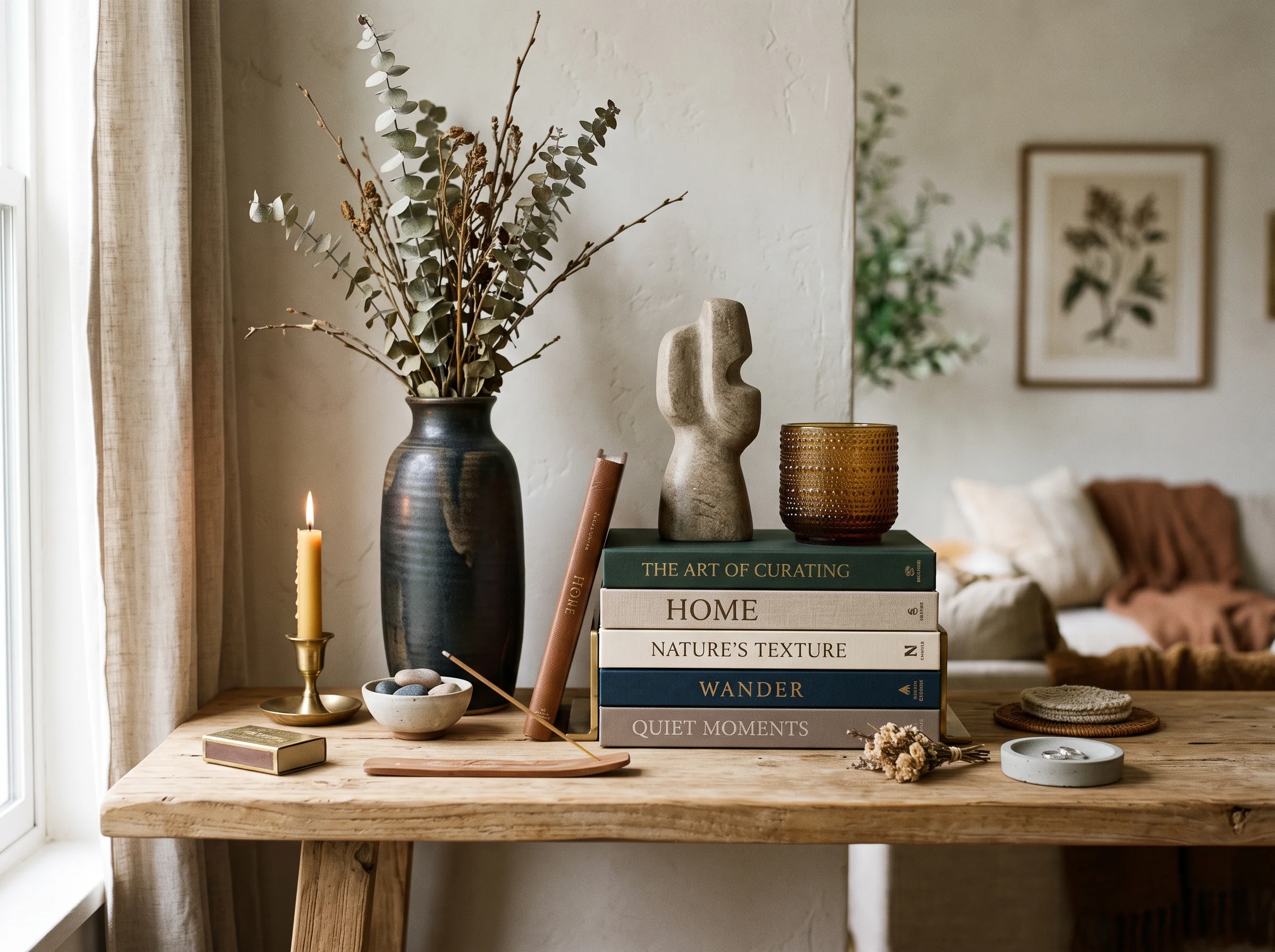
The 3-5-7 rule earns its keep in styling — the finishing layer of decorating. It's most useful for vignettes on a console or coffee table, art groupings and gallery walls, throw pillows on a sofa or bed, and plant arrangements on a shelf or in a corner. In all of these, an odd count almost always looks more composed than an even one. If you're staring at a coffee table that feels "off," try removing or adding one item to reach an odd number — it fixes more arrangements than you'd expect.
"Odd numbers can't be paired off, so your eye keeps moving among them. That small, restless motion is what reads as 'interesting.'"
The Other Rules Designers Actually Use
Here's the honest context the tip lists leave out: 3-5-7 is one rule among many, and on its own it won't make a room. Professional designers lean on a handful of principles far more load-bearing than the odd-number trick.
The 60-30-10 color rule. This is the backbone of a balanced palette. Roughly 60 percent of the room is a dominant color (usually walls and large surfaces), 30 percent is a secondary color (upholstery, curtains), and 10 percent is an accent (pillows, art, objects). Get this ratio right and a room feels cohesive; ignore it and it feels either flat or chaotic. This one matters far more than how many candles are on your mantel.
The rule of thirds. Borrowed from photography, this says don't center everything. Offsetting a key element — hanging art slightly off-center, placing a focal object a third of the way along a shelf — creates more visual interest than rigid symmetry. Perfectly centered rooms can feel stiff; a little intentional asymmetry brings them to life.
The scale rule for groupings. When you group objects, vary their heights. A cluster where everything is the same height reads as a flat line and looks accidental. Mix a tall element, a medium one, and a low one so the grouping has a silhouette. This is the rule that makes styled shelves look professional.
The triangle rule for shelves. When styling shelves or a mantel, arrange objects so your eye travels in triangles rather than straight rows — a tall item on one side balanced by two shorter items and a horizontal object on the other. The triangular movement keeps the arrangement dynamic and balanced at once.
What Designers Don't Do
The most important thing to understand about all of these rules — including 3-5-7 — is that professionals don't follow them rigidly. They follow them because they understand why they work, which also tells them when to break them. A pair of matching lamps flanking a bed deliberately uses even-number symmetry for a calm, formal effect, and it's correct. A perfectly centered fireplace with symmetrical styling can be exactly right for a traditional room.
Rules are a starting point and a diagnostic — a way to explain why something feels off and a first move to fix it. They are not a law. The designer's real skill is knowing which principle a given room needs and when the effect you want justifies ignoring the rule entirely.
The Designer's Rulebook at a Glance
| Rule | What It Governs |
|---|---|
| 3-5-7 (odd numbers) | Grouping decorative objects |
| 60-30-10 | Color balance across the room |
| Rule of thirds | Placement and intentional asymmetry |
| Scale / vary heights | Silhouette of a grouping |
| Triangle rule | Styling shelves and mantels |
Seeing the Rules Before You Apply Them
The catch with every one of these principles is that reading them and applying them are different skills. You can know the 60-30-10 rule and still not be sure whether your specific accent color works against your specific walls. This is where visualizing beats memorizing. AI lets you test these principles on your actual room — try the palette, see the grouping, adjust the balance — and watch the effect photorealistically before you buy a thing or hang a nail.
So, is the 3-5-7 rule real? Yes. Is it the secret to a great room? Not remotely — it's a minor styling tool. The rules that actually shape a space are about color balance, placement, and scale, and even those bend once you understand why they exist. Learn the principles, then see them play out in your own room rather than trusting that a group of five will save an arrangement that's wrong for deeper reasons.