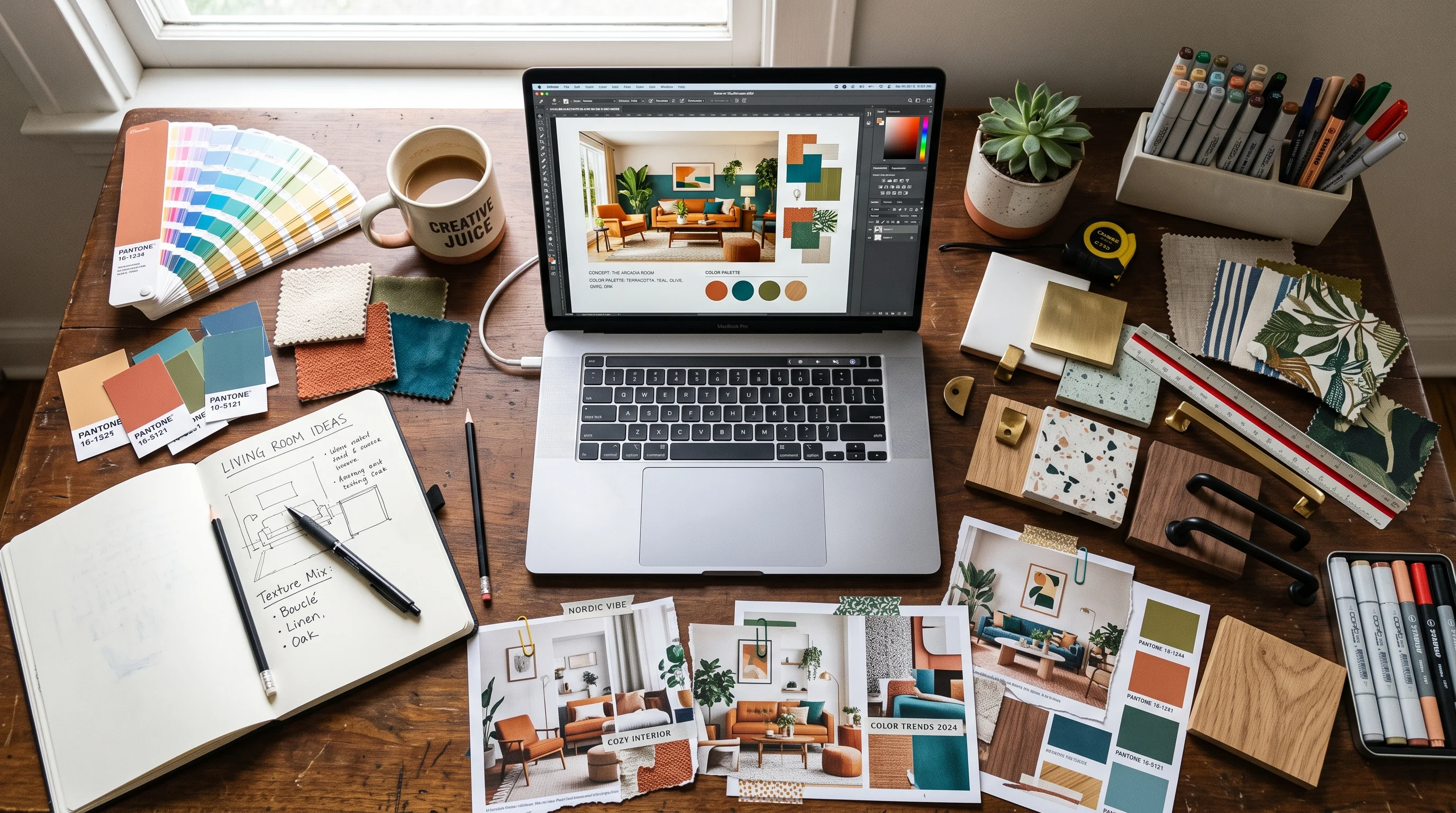
The mood board is where a design concept is either won or quietly lost. It is the first tangible thing a client sees, the artifact that translates the vague brief in their head into a direction they can react to. Done well, it aligns everyone and earns a fast approval that lets the real work begin. Done poorly — or slowly — it produces the dreaded response every designer knows: the client tilts their head, says "I'm not sure I'm feeling it," and you are back to the start, hours of curation wasted.
The traditional mood board has two chronic problems. It takes a long time to assemble, and even a beautiful one leaves a gap between the collage of references and what the client's actual room will look like. This guide covers how to build mood boards that get approved on the first pass, and how AI collapses both problems — turning a day of curation into minutes, and turning an abstract board into a photoreal preview of the client's real space.
What a Strong Mood Board Does
A mood board is not decoration and it is not a Pinterest dump — it is a communication and alignment tool. Its job is to establish a shared visual language between you and the client before any detailed design work begins, so that you are both building toward the same thing. A strong board does three things at once: it captures a coherent direction (a single, legible mood rather than a scatter of ideas), it demonstrates your expertise and taste, and it gives the client a concrete thing to approve or adjust.
The most important word is coherent. A weak mood board shows twenty appealing but unrelated images and leaves the client to guess how they combine. A strong one shows a tight, intentional set that reads as one clear direction — this palette, these materials, this feeling — so the client's reaction is a decision rather than a shrug. The board's power comes from its editorial discipline, not from the number of images on it.
Gathering and Reading Reference Images
Every mood board starts with references, and reading them well is the underrated core skill. When you collect inspiration for a project, you are not looking for rooms to copy — you are extracting the elements that define a direction. From each reference, pull four things: the palette (dominant, secondary, accent colors and their temperature), the materials (woods, metals, stones, textiles and their finishes), the mood (calm, dramatic, warm, airy), and the details worth borrowing (a specific fixture style, a texture, a proportion).
The discipline is to reference deliberately, not indiscriminately. Choose one anchor image that sets the overall direction and pull only compatible elements from the rest. Reference images that share a temperature and contrast level can be combined into a coherent board; images that fight each other will produce a board that fights itself. This is exactly the read-and-adapt skill our homeowner guide to designing from reference photos teaches — and it is the foundation AI concepting is built on.
Building a Cohesive Palette and Materials Story
Once you have read your references, the board itself is built around two pillars: a palette and a materials story. The palette should follow a clear hierarchy — a dominant neutral or base (typically 60 percent of the room), a secondary color (around 30 percent), and an accent (the remaining 10 percent). Present these as actual color blocks or swatches, not just implied by photos, so the client sees the exact relationship you intend.
The materials story is what gives the board depth and makes it feel real rather than decorative. Show the actual materials the room will use — the wood tone, the stone, the metal finish, the key textiles — and make sure they cohere. A common failure is a palette that works but materials that clash: warm earthy colors paired with cold chrome and glossy surfaces reads wrong no matter how nice each element is alone. The palette and the materials have to tell the same story. When they do, the board reads as a place, and the client can feel the room before it exists.
"A mood board earns approval when the client stops imagining and starts recognizing — when they look at it and think 'yes, that's my room,' not 'I think I see where you're going.'"
From Mood Board to Photoreal Concept
Here is the leap that changes the whole client conversation. A mood board, however beautiful, is still an abstraction — a collage the client has to mentally translate onto their own four walls. That translation is exactly where approvals stall, because the client cannot picture how the palette and materials will actually land in their room with its specific light, proportions, and windows.
AI closes that gap directly. You can take the reference images and direction from your mood board and generate a photorealistic render of the client's actual room in that concept — same palette, same materials, same mood, applied to their real space. Instead of asking the client to imagine, you show them. The board establishes the direction; the render proves it works in their home. Upload the client's room and your reference images to Decorb and turn a mood board into a photoreal preview of their actual room in minutes. This is the single most powerful upgrade available to the concept stage, and it is why AI-assisted concepts get approved faster. Our fast render alternative guide covers how this fits your production workflow.
Presenting Boards Clients Approve Fast
How you present a board matters as much as the board itself. A few principles that consistently speed approval:
- Present one strong direction, not five options. Offering five choices signals you have not committed and pushes the hard decision onto the client. Present one confident direction (with perhaps one alternative), and you lead rather than defer.
- Tell the story out loud. Walk the client through the why — the mood, the palette logic, how it serves their brief and their lifestyle. A narrated board lands far harder than one emailed silently.
- Anchor it to their room. Show the concept applied to their actual space, not just abstract references. Recognition beats imagination every time.
- Frame it against their brief. Explicitly connect the board back to what they told you they wanted, so the approval feels like a confirmation of their own goals.
The combination of a coherent board, a confident narrated presentation, and a photoreal preview of their real room is what turns "I'm not sure" into "yes, let's do it." For the full playbook on presentations that win the work, see our guide to winning clients with AI-powered presentations.
Iterating on Feedback Quickly
Even a strong first concept usually draws some feedback — "warmer," "less busy," "can we try a darker floor." In the traditional workflow, each round of feedback meant re-curating the board or commissioning a new render, turning revisions into days of turnaround that frustrate the client and eat your margin. Speed of iteration is a competitive advantage most designers do not have.
With AI concepting, iteration collapses to minutes. A client says "warmer and less cluttered," and you regenerate the concept with that adjustment while the direction is still fresh in everyone's mind — sometimes within the same meeting. Fast iteration does two things: it keeps the client engaged and delighted (responsiveness reads as care), and it prevents the momentum-killing gap where a project stalls waiting for the next version. The designers who close fastest are the ones who can turn feedback into a revised visual before the client's enthusiasm cools.
Keeping Brand Consistency Across Concepts
For a working designer, every mood board is also a brand asset. The boards you present are, over time, the clearest signal a client receives about who you are and what you stand for aesthetically — and inconsistency across them dilutes that signal. A designer whose concepts wander from cottage to industrial to glam depending on the project reads as a competent generalist; a designer whose boards share a recognizable through-line reads as someone with a point of view, and point of view commands both trust and premium fees.
Brand consistency does not mean every concept looks identical — you still serve each client's distinct needs. It means your presentation carries a consistent signature: the same layout and typography on your boards, a recurring quality of light or restraint in how you render rooms, a repeated way of narrating direction. When you use AI to generate concepts, this consistency becomes easier to hold, because you can guide every concept through the same aesthetic lens and lean on reference images that reflect your signature. The result is a body of work that looks like it came from one designer with a clear vision — which is exactly the impression that turns a one-off client into a referral source and a follower into a booking.
Mood Board Mistakes to Avoid
The common ways concept boards fail their designers:
- Too many unrelated images. A board without a single coherent direction leaves the client confused rather than aligned. Edit ruthlessly toward one mood.
- Palette without a materials story. Colors alone read decorative; the materials are what make a board feel like a real room.
- Clashing materials. A lovely palette undermined by finishes that fight each other. Make the palette and materials tell the same story.
- Staying abstract. Leaving the concept as references the client must mentally translate is where approvals stall. Show it in their actual room.
- Offering too many options. Five directions signal indecision and push the hard call onto the client. Lead with one confident direction.
- Slow iteration. Days-long turnaround on feedback kills momentum. Iterate fast while enthusiasm is high.
There is also a quieter benefit to getting the concept stage right that is easy to overlook: it protects the rest of the project. A board that wins genuine, informed approval at the start means the client has bought into the direction before you invest in detailed design, sourcing, and procurement — so the expensive later stages proceed on solid ground rather than on a direction the client only half-agreed to. Most of the painful mid-project reversals designers dread trace back to a concept that was approved out of politeness rather than conviction. A photoreal preview of the client's real room turns a polite nod into a genuine yes, and that genuine yes is what makes everything downstream go smoothly.
The mood board remains one of the most important artifacts in your process — it is where alignment is built and concepts are sold. Read your references well, build a coherent palette and materials story, present one confident direction anchored to the client's real room, and use AI to collapse both the curation time and the abstraction gap. Do that and the concept stage stops being a bottleneck and becomes the fastest, most persuasive part of your workflow. Continue with our guide to building a portfolio with AI concepts and the complete AI toolkit for designers.